Color Psychology In DIY Home Design
Color psychology is the secret weapon of interior design, shaping how we feel and interact with the spaces we inhabit. Every hue holds its own emotional power, subtly influencing our moods, behaviours, and energy levels. From the calming effect of blues to the energizing burst of reds, colour choices can define the purpose and atmosphere of a room.
The symbolism of colour is just as impactful. For instance, green often represents nature and tranquility, while yellow evokes feelings of optimism and creativity. These associations can be universal or deeply personal, making it essential to choose colours that align with the emotions you want to inspire in your space.
Research in color psychology reveals fascinating insights into how people respond to different hues. Blues, for instance, are universally favoured for their calming properties, making them perfect for bedrooms and bathrooms. On the other hand, vibrant colours like orange and red stimulate energy and are ideal for social spaces like kitchens or living rooms.
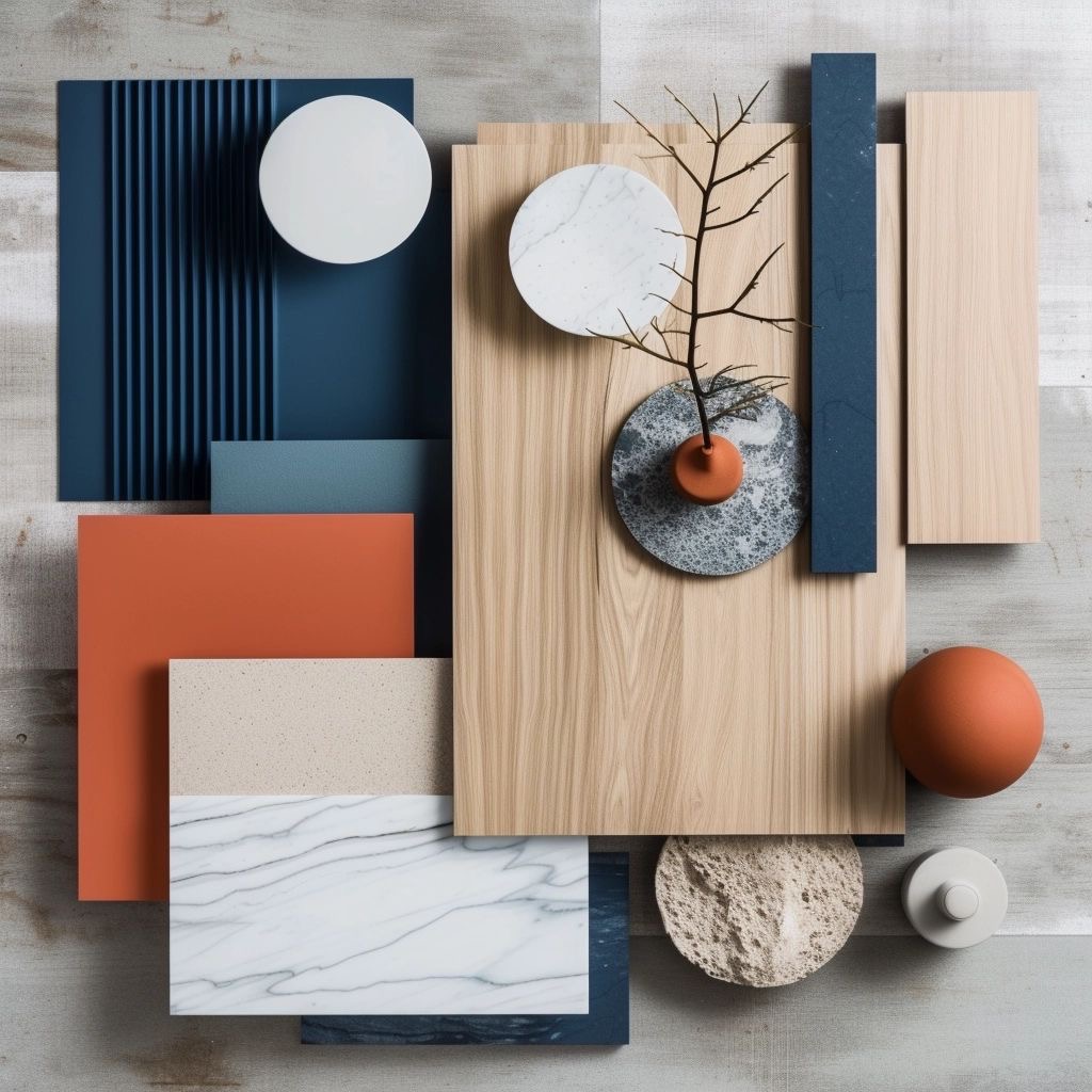
Using color psychology thoughtfully is about more than just picking a shade—it’s about creating harmony. Lighting, textures, and complementary tones all play a role in how colours come to life. By selecting the right palette, you can transform your home into a space that’s both beautiful and functional, reflecting your personality and lifestyle.
Ready to explore how each colour can elevate your space? Let’s dive in!
Color Psychology in Interior Design: A Practical Approach by Color
Interior design thrives on colour psychology, transforming spaces into tailored havens for specific moods and purposes. Here’s a guide to how different colours can be used effectively in various settings:
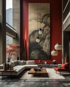
Red: Energy & Passion
•Impact: Bold and stimulating, red increases energy and draws attention. It’s perfect for social and high-energy spaces.
•Use in Design:
•Great for dining rooms to spark conversation and appetite.
•Works as an accent wall in living rooms to add warmth and vitality.
•Tips: Pair red with neutral tones to balance its intensity and avoid overstimulation.
Blue: Calm & Focus
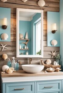
•Impact: Blue evokes calm, relaxation, and focus, making it ideal for restful spaces.
•Use in Design:
•Perfect for bedrooms and bathrooms to create a serene retreat.
•Use in offices to boost concentration and productivity.
•Tips: Opt for soft pastel blues for tranquility or deeper navy tones for sophistication. Complement with natural wood or white for a clean, balanced look.
Yellow: Optimism & Creativity
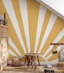
•Impact: Yellow is cheerful and energizing, associated with happiness and creativity.
•Use in Design:
•Brighten kitchens or breakfast nooks with yellow to evoke energy in the mornings.
•Use in playrooms or studios to spark creativity.
•Tips: Use as an accent or pair with white or grey to avoid overwhelming the space.
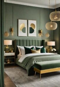
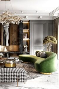
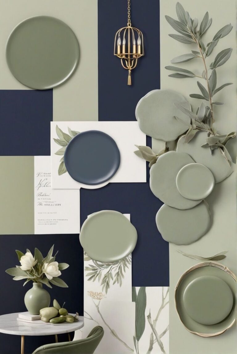
Green: Tranquility & Renewal
•Impact: Green represents nature and balance, promoting calm and renewal.
•Use in Design:
•Bring the outdoors inside with green walls or furniture in living rooms or sunrooms.
•Ideal for bedrooms to promote restful sleep.
•Tips: Layer shades of green with natural elements like wood and plants for a cohesive look.
Grey: Sophistication & Versatility
•Impact: Grey is neutral and timeless, offering sophistication and adaptability.
•Use in Design:
•Perfect as a base colour in living rooms or bedrooms for a modern feel.
•Works well in offices for a professional and sleek ambiance.
•Tips: Add warmth with pops of colour or textured materials like rugs and throws.
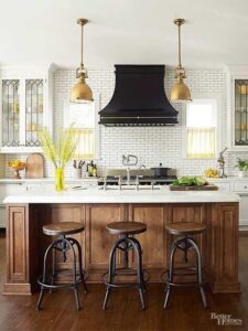
White: Purity & Openness
•Impact: White creates a sense of cleanliness and openness, enhancing natural light.
•Use in Design:
•Excellent for kitchens and bathrooms to maximize light and cleanliness.
•Use in small spaces to make them feel larger and airier.
•Tips: Pair with warm accents like wood or pastel colours to avoid a sterile look.
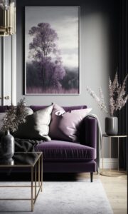
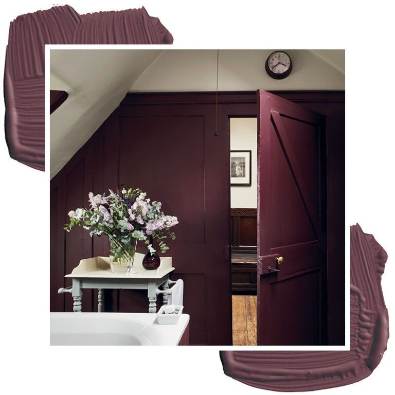
Purple: Luxury & Creativity
•Impact: Purple is associated with royalty, luxury, and creativity.
•Use in Design:
•Add depth to bedrooms or living rooms with rich purples like plum.
•Use lighter shades, like lavender, in bathrooms for a relaxing, spa-like feel.
•Tips: Use sparingly as an accent colour or combine with grey for a sophisticated look.
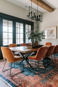
Orange: Energy & Warmth
•Impact: Orange exudes energy, warmth, and enthusiasm.
•Use in Design:
•Energize exercise rooms or home gyms with orange accents.
•Use in kitchens or dining areas for a welcoming vibe.
•Tips: Pair with neutral tones to prevent it from overpowering the space.
Practical Tips for Applying Color Psychology
•Lighting: Test colours in both natural and artificial lighting to see how they shift throughout the day.
•Textures: Use textiles, rugs, and art to introduce colour without permanence.
•Balance: Maintain harmony by grounding vibrant colours with neutrals or complementary shades.
•Purpose: Match the colour to the function of the room and the mood you want to create.
By using colour psychology thoughtfully, you can transform your home into a space that reflects both beauty and purpose.
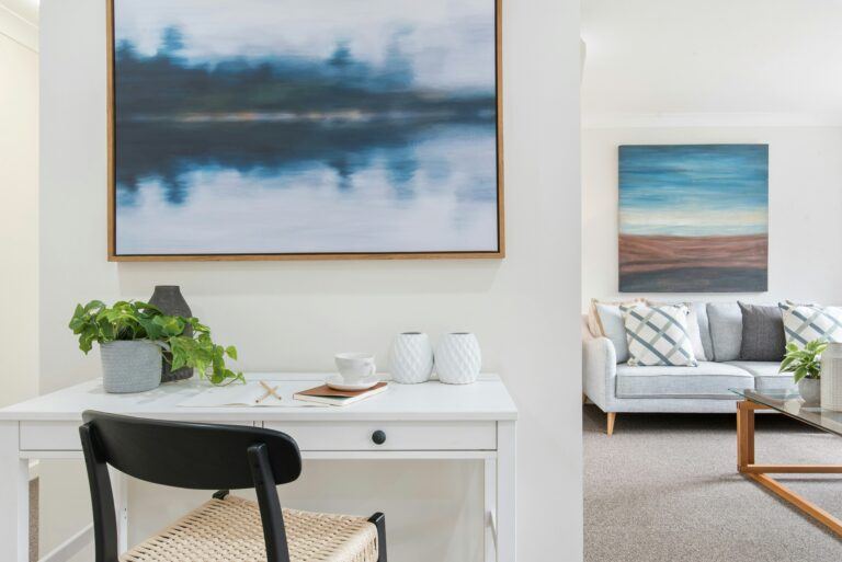

Great info. White paired with wood looks better than the all white trend.
White paired with wood creates a balanced and warm aesthetic that the all-white trend often lacks. The contrast between the cool, clean look of white and the natural, earthy tones of wood adds depth and texture to a space. Wood brings warmth and a sense of comfort, while white keeps the space bright and airy. This combination creates a more inviting and visually interesting environment compared to the sterile feel of an entirely white space. The natural elements of wood also add timeless appeal, making the space feel more grounded and lived-in.