How To Select A Paint Colour
Here’s our suggestion on how to select a paint colour
 Start by taking a good look around your space, and I mean really looking at your existing furniture and accessories. The colors and styles of your sofas, rugs, and even art pieces can be little guides leading you to your perfect paint shade.
These favorite items in your space actually have all the hints you need. For example, that bold oriental rug or those chic throw pillows can inspire you to try out similar hues on the walls. It’s like giving your room a matching jacket, making everything feel in sync.
Textures matter too. A plush velvet couch might make you think about deep and rich tones, while a linen chair could sway you towards soft and airy shades. Matching paint with the texture and style of your key pieces creates a more cohesive and inviting vibe.
The key here is to embrace the journey of exploring colors while respecting what you already have. There’s no need to overhaul every piece—sometimes it just takes a little color tweak to make the magic happen. Tapping into the vibe of your room’s personality gets you one step closer to picking a shade that’s truly ‘you.’.
Proofing with Palette: Leveraging Inspiration and Trends
When it comes to drawing inspiration on how to select a paint colour, let trends be your guide but not your dictator. Exploring what’s trending can offer fresh ideas, but remember to always weave your own taste into the mix. From soft pastels to deep moody palettes, there’s a world of options to explore.
 Think about where you’re starting and ending with your colours. Darker tones on floors blending into lighter tones as you move upward create a soothing transition. It’s a subtle way to add depth without overwhelming your spaces.
Dive into the fascinating world of color psychology, where every hue carries its own vibe. Lighter shades can create calmness and soothe a busy mind, while bold colors are your go-to for a shot of energy in the room.
Consider how different lighting setups alter color perceptions. The kind of light coming from your windows can shift colors in surprising ways. Northern exposure might cool your reds to deep plums, while southern exposure can warm up your blues to a soft teal.
Don’t forget undertones—they’re sneaky little things that can make a beige look pinkish or a white seem too cold. Always compare undertones by viewing colors side by side in varied lighting to ensure you’re getting what you think you’re getting.
Harmonizing Adjacent Areas: Crafting Cohesive Spaces
When you’re pulling your rooms together, make sure neighboring spaces play nice with each other. It’s not about matching colors perfectly but creating a rhythm that flows from one room to the next without a jarring experience.
Sometimes it’s as simple as going a shade lighter or darker than what you’ve got in an adjoining room. This little trick keeps the visual harmony intact while allowing each room to stand out with its own unique vibe.
And hey, don’t shy away from bold colors for those special areas where you want to make a statement. Maybe an accent wall or a colorful nook can turn heads and add that wow factor you’ve been looking for.
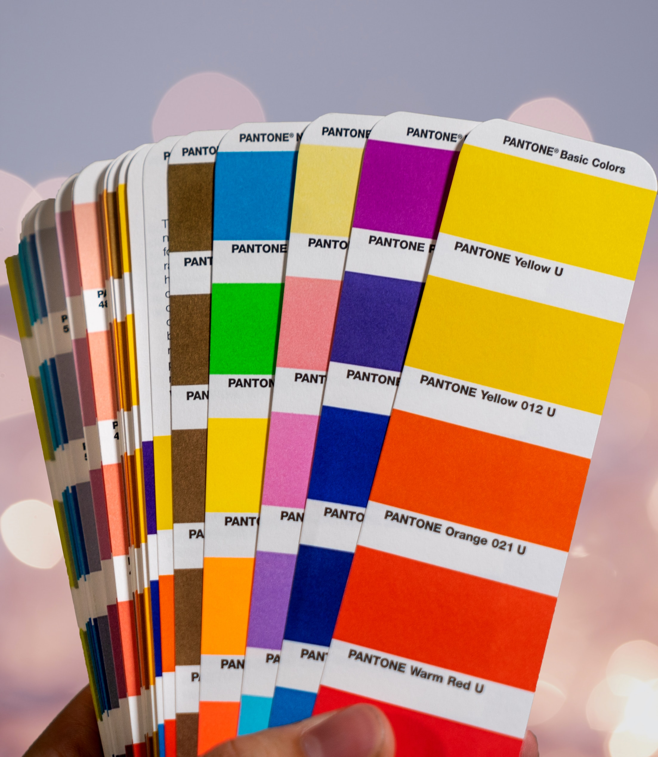
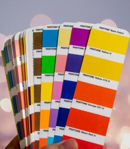
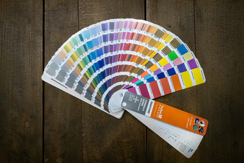
Play around with different samples and swatches. They’re like crystal balls showing how various shades behave in your specific space. Move them around, pin them up, and see how they react to different moods and lighting.
Last but not least, give some thought to the finish. A matte finish can hide imperfections, while a gloss finish might highlight the room’s best features. This final touch brings all the colour choices together, giving your home a polished and well-thought-out appearance.


That’s a very nice introduction to selecting paint colours
Thanks for reading. If you have questions, contact us