What Is A Colour Scheme
What Is a Colour Scheme: Understanding the Basics of Colour Theory
Colour has the power to transform spaces and emotions — but using it effectively starts with understanding the fundamentals. In this article, we’ll explore what a colour scheme is, break down basic colour theory, and show how to apply this knowledge when designing interiors or creating palettes.
Colour Theory: Vocabulary You Should Know
Before diving into colour schemes and the colour wheel, it’s important to understand some key colour terms:
• Hue: The purest form of a colour. Examples include red, yellow, and blue.
• Value: How light or dark a colour appears. Adding white raises value; adding black lowers it.
• Tint: A hue mixed with white (e.g., red + white = pink).
• Shade: A hue mixed with black (e.g., red + black = burgundy).
• Tone: A hue mixed with gray, creating a more muted, subtle version.
• Chroma (or saturation): Refers to the intensity or purity of a colour.
The Colour Wheel Explained
The colour wheel is a visual guide used to understand colour relationships. Based on the RYB (red, yellow, blue) model, it consists of:
• Primary colours: Red, yellow, blue — these cannot be created by mixing other colours.
• Secondary colours: Green, orange, violet — made by mixing primary colours.
• Tertiary colours: Six combinations of primary and secondary hues (e.g., blue-green, red-orange).
Understanding how these colours relate to one another is essential when creating colour schemes.
Warm vs. Cool Colours
Draw a line through the centre of the colour wheel to separate warm colours (reds, oranges, yellows) from cool colours (blues, greens, purples).
• Warm colours evoke energy, warmth, and action.
• Cool colours feel calm, soothing, and serene.
This simple concept helps in setting the mood and temperature of your space.
What Is a Colour Scheme?
A colour scheme is a strategic combination of colours used together in a space, product, or design. A good colour scheme creates harmony, balance, and visual appeal. Here are the most popular types:
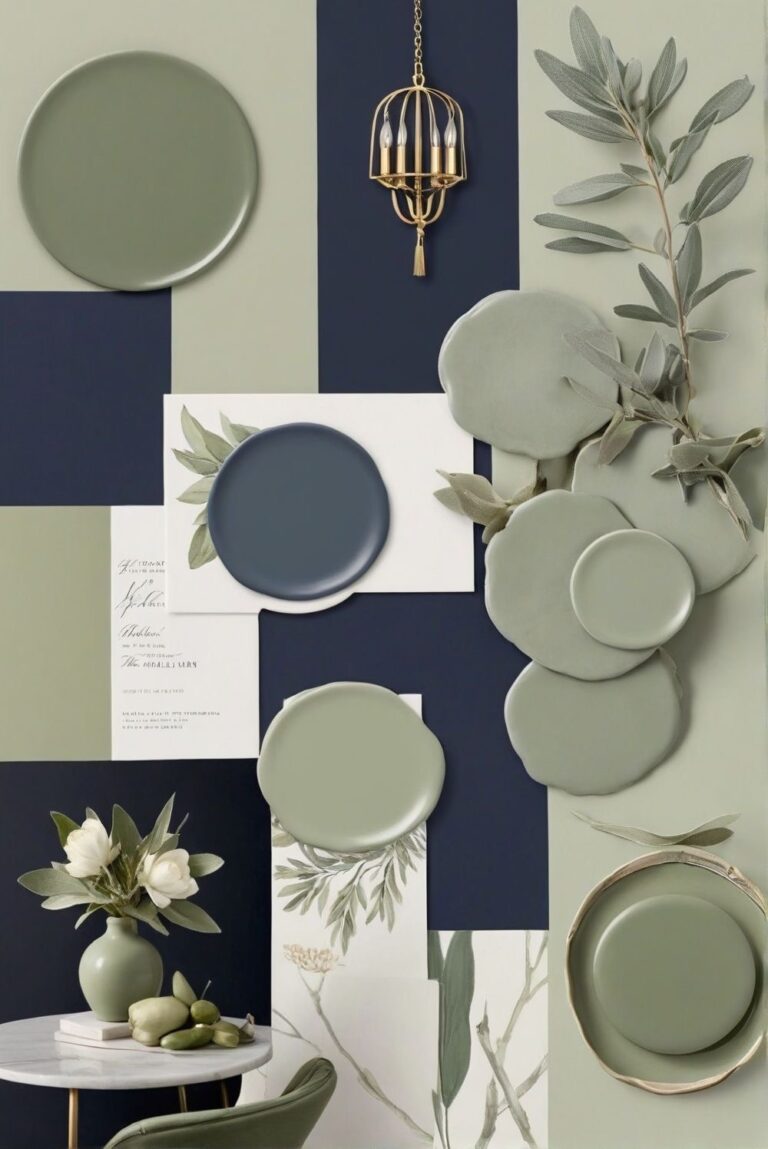
1. Monochromatic Colour Scheme
Uses one hue in various tints, shades, and tones. It’s simple and calming, perfect for minimal interiors. Add texture and pattern to avoid a flat look.
2. Analogous Colour Scheme
Uses three colours next to each other on the wheel (e.g., yellow, yellow-green, and green). This scheme is harmonious and easy to work with.
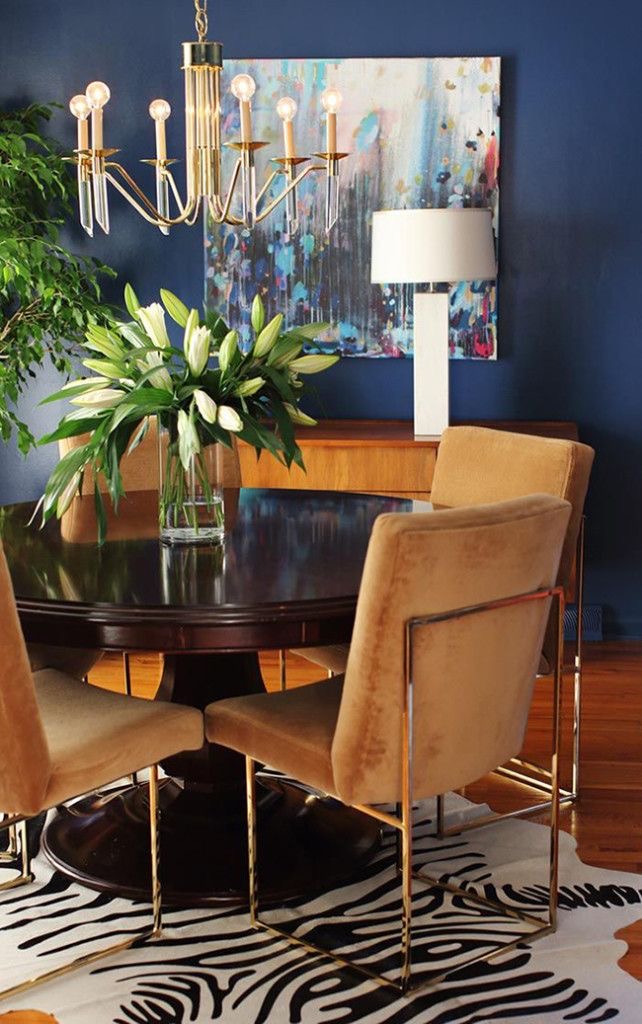
3. Complementary Colour Scheme
Uses colours directly opposite on the wheel (e.g., blue and orange). It’s bold and dynamic but works best when one colour dominates.
4. Split-Complementary Scheme
A variation of the complementary scheme that uses the base colour and the two adjacent to its opposite. It offers contrast without being too intense — a favourite for balanced yet vibrant designs.
5. Triadic Colour Scheme
Uses three colours evenly spaced on the wheel (e.g., red, yellow, blue). It’s balanced and lively. Use the 60-30-10 rule for best results: 60% dominant, 30% secondary, 10% accent.
6. Tetradic (Rectangle) Colour Scheme
Involves two complementary colour pairs. It’s the most complex but offers maximum variety. Choose one dominant colour and carefully balance warm and cool tones.
7. Achromatic Colour Scheme
Literally “without colour” — black, white, and greys. Clean and sophisticated. Add texture or a pop of colour to prevent dullness.
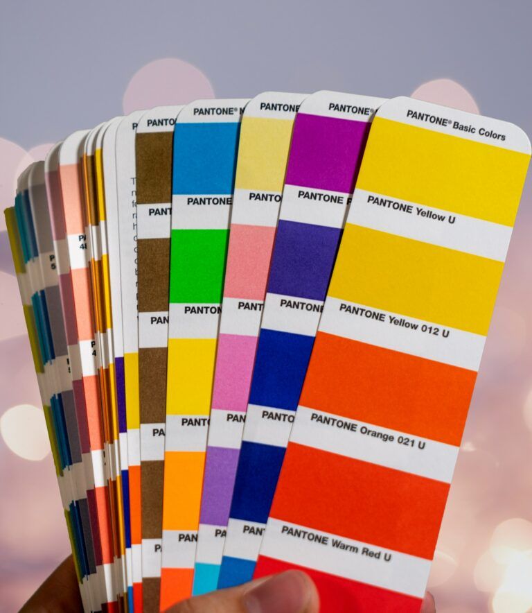
Colour Tools to Explore
To master colour, use tools like:
• Pocket Colour Wheels (available on Amazon or craft stores)
• Paint Visualizers from Behr, Benjamin Moore, Sherwin-Williams
• Nix App for real-world colour matching
• Online Colour Scheme Generators like Coolors or Adobe Color
Why Understanding Colour Schemes Matters
Learning colour is like learning a new language. Once you understand the basics, it becomes easier to identify what you like and recreate schemes you see online or in real life. Many people get stuck copying Pinterest palettes without knowing why the colours work together.
With this foundation, you’re better equipped to experiment with colour — or simply ask someone who loves it (like me).